...there be some good news about the Mayfair Theatre on CBC.ca.
I took in the press conference at Ottawa City Hall re: arts/heritage funding issues this morning, whilst taking care of other business(IE: day-job hunting). Hoping to put up a few photos later on.
More to come...
Tuesday, November 18, 2008


Wednesday, September 03, 2008
Closing the Second Issue-Work in Progress
Started work on the last page of Local Hero # 2 this week, and so far it's been a fun slog. The definition of a "work in progress".
More as it develops...

More as it develops...
Thursday, August 28, 2008
U of O=Gotham U?
Some parts of Ottawa just put me in mind of that other city I know too well. Such as parts of the University of Ottawa campus. Doesn't this front entrance to the computer science building put you in mind of stuff that Furst would design?


Wednesday, July 09, 2008
Font Addictions
Eric Trautman recently noted his own addiction to font collecting, and I'd be remiss to not make my own confession along these lines. For me, it started in high school with the first Letraset catalogue I'd ever laid eyes or hands upon. Back then, not so long ago by some lights, they still sold mostly dry transfer sheets. Software for home computers was a few years off. When I saw the options available in the catalogue, and started recognizing a handful or so from TV-watching...Countdown and Data 70 from Space: 1999, Stop from the original Galactica and so on...well, it's continued from there.
I get the same online newsletter, and download freebies that catch my eye from time to time. Thanks to this one company, I've even tried my hand at designing them myself, as noted a few years back in this LJ. It's another sort of fun, and one I mean to get back to as soon as the time's freed up.
I should really try out that freebie copy of Typetool I got from that magazine cover disk a couple of years back, as well. It only works when Classic mode's turned on, but that's okay for me.
I get the same online newsletter, and download freebies that catch my eye from time to time. Thanks to this one company, I've even tried my hand at designing them myself, as noted a few years back in this LJ. It's another sort of fun, and one I mean to get back to as soon as the time's freed up.
I should really try out that freebie copy of Typetool I got from that magazine cover disk a couple of years back, as well. It only works when Classic mode's turned on, but that's okay for me.
Wednesday, February 13, 2008

Sunday, November 25, 2007
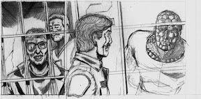
Local Hero: In the cells with the Eagles and a Gator
Thought you might appreciate a visual update...
Sunday, November 11, 2007
One small lesson
Learned the hard way.
Never use Deleter colour pens on Peter Pauper Press sketchbooks. Sure, the results look cool. But the ink goes right through the page. (Certain other brands of brush pen marker, too, while I'm at it.)
Prismacolor Premier fine line markers, though? That's another, happier story.
I still like the sketchbooks. I just need thicker paper for some types of pen.
Never use Deleter colour pens on Peter Pauper Press sketchbooks. Sure, the results look cool. But the ink goes right through the page. (Certain other brands of brush pen marker, too, while I'm at it.)
Prismacolor Premier fine line markers, though? That's another, happier story.
I still like the sketchbooks. I just need thicker paper for some types of pen.
Saturday, October 13, 2007

Wednesday, October 10, 2007

Subscribe to:
Posts (Atom)