Last week, She has her own goals in mind for the answers to that question, regarding accessibility, and she's been getting useful answers from her friendlist. For myself, selfishly, I do have a list of favourites. Many - most? - of these favourites have very little to do with such concerns. There's a lot of aesthetic considerations and a lot of personal nostalgia in play with my list. There is a certain amount of privilege - the privilege of being sighted all my life thus far - in my thinking here. This is selfish. Absolutely so.
That said, I am going to go into some detail about my own list of favoured fonts. In this entry, and probably others down the line.
I start with Space: 1999. That TV series in the mid-1970's created by Gerry and Sylvia Anderson was where I first started to care about typefaces, fonts, that sort of thing. Particularly the first season. Moonbase Alpha, the main backdrop of the series, doomed to wander the universe by an ill-placed nuclear waste dump turning a large chunk of our Moon into a giant fusion rocket...that place had a particular design aesthetic. Signage across the moonbase was in a font called "Countdown". Designed by Colin Brignall, I don't know how it reached the attention of Space: 1999's set designers and graphic designers.
He also designed Superstar, the font that Milton Glaser incorporated into the classic "Bullet" logo of DC Comics. So there's two.
Back to Space: 1999. The space suits were jumpsuits with the helmets, life support hardware, and so on worn over them. The life support hardware packs - front and back - were numbered. The numerals came from "Data 70". The packs labelled "1" were usually worn by Martin Landau in character as moonbase commander John Koenig when a scene would call for him to expect to do EVA work, and had that numeral inverted. Not sure why.
(There's apparently an argument over whether Data 70 is a knock-off of another font, Westminster. If you're interested, check this essay out.)
More to follow...
Showing posts with label science fiction. Show all posts
Showing posts with label science fiction. Show all posts
Monday, September 21, 2020
FONTS: Personal Favourites


Saturday, January 12, 2013
From Lee Barnett: You'll Never Believe a Man Can Fly
What if the first super-hero in the world was a British ad man?
What if that first super-hero got his origin by way of an experiment gone wrong via courier service mishap?
What if that first super-hero had his attempt to formally go public messed up by a news service's infamous penchant for spelling and grammar mistakes?
Lee Barnett's got a recently-revised theory to entertain you with. He's been serializing it for the past few days, and it'll continue for a few weeks yet: You'll Never Believe a Man Can Fly. He explains some of what's in the works here. You may want to follow along, or purchase an e-book edition as offered at his end of things.
Oh, and one of the illustrations accompanying the text is one of mine.
You might be interested.
What if that first super-hero got his origin by way of an experiment gone wrong via courier service mishap?
What if that first super-hero had his attempt to formally go public messed up by a news service's infamous penchant for spelling and grammar mistakes?
Lee Barnett's got a recently-revised theory to entertain you with. He's been serializing it for the past few days, and it'll continue for a few weeks yet: You'll Never Believe a Man Can Fly. He explains some of what's in the works here. You may want to follow along, or purchase an e-book edition as offered at his end of things.
Oh, and one of the illustrations accompanying the text is one of mine.
You might be interested.
Sunday, July 22, 2012
CANCON-2012 Flyer Design
A little bit of portfolio stuff re: an upcoming event...
If you want a higher-resolution edition, in order to help get the word out, I could upload that to a public-access folder on Dropbox.
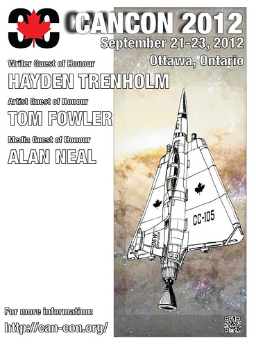
If you want a higher-resolution edition, in order to help get the word out, I could upload that to a public-access folder on Dropbox.
Wednesday, September 07, 2011
Counting Down to CAN-CON 2011
I've been meaning to get back "out there" in the convention and book sale circuit, and this convention newly revived was - is - part of an ongoing, improvised plan of solving that matter.
I'll be sitting on a few panel discussions telling tales and pretending that I have useful advice to give, but in reality, I'll be there to learn. From the other panellists, from the audience, from the rest of the CAN-CON 2011 organizers.
Two more days, and I'll see whichever of you cares to attend there.
I'll be sitting on a few panel discussions telling tales and pretending that I have useful advice to give, but in reality, I'll be there to learn. From the other panellists, from the audience, from the rest of the CAN-CON 2011 organizers.
Two more days, and I'll see whichever of you cares to attend there.
Sunday, August 28, 2011
CAN-CON 2011
I've been busy elsewhere for a fair while now. The day-job's been part of the reason for that, so have family-related matters, and a bit of stuff on my other blogs. If you've been following those other blogs, you've possibly already got a clue as to where this particular post is going.
But today is the day the situation's made clear:
I'm serving on the organizing committee - "ConComm" - of a local convention as a design consultant. The convention is CAN-CON 2011, the Conference on Canadian Content in Speculative Arts and Literature.
CAN-CON was revived last year after spending the previous decade in something like a coma. This is our second year back, and we're looking to build on the success of last year's revival. Our comics-related line-up is led off by Comics Guest of Honour Leonard Kirk.
But we don't stop there, including local writer/artists Jay (Kagigi the Raven) Odjick and Janet Hetherington.
Oh! I'll be sitting on a couple of panels as well!
If you should happen to be in Ottawa on the September 9th-11th weekend, I hope we see you there!
But today is the day the situation's made clear:
I'm serving on the organizing committee - "ConComm" - of a local convention as a design consultant. The convention is CAN-CON 2011, the Conference on Canadian Content in Speculative Arts and Literature.
CAN-CON was revived last year after spending the previous decade in something like a coma. This is our second year back, and we're looking to build on the success of last year's revival. Our comics-related line-up is led off by Comics Guest of Honour Leonard Kirk.
But we don't stop there, including local writer/artists Jay (Kagigi the Raven) Odjick and Janet Hetherington.
Oh! I'll be sitting on a couple of panels as well!
If you should happen to be in Ottawa on the September 9th-11th weekend, I hope we see you there!
Wednesday, April 13, 2011
Skies, Then and Now
Irony found
in this fact:
I grew up in the Prairies
from Alberta
to Manitoba.
And so rarely
would I look up
at the skies
and the stars.
Despite watching
Adama and Kirk,
Rogers and Koenig,
I would not look
up at the skies
where, so the TV said,
their adventures
and trials played out.
Now, in Ottawa,
despite tales in the news
of light pollution
masking the skies,
I look up and see
at last, at long last,
Dubhe and Bellatrix,
Polaris and Rigel.
And still,
I do not quite
understand
what it is I see
at night, when
the skies are clear...
or at least...
clear enough.
in this fact:
I grew up in the Prairies
from Alberta
to Manitoba.
And so rarely
would I look up
at the skies
and the stars.
Despite watching
Adama and Kirk,
Rogers and Koenig,
I would not look
up at the skies
where, so the TV said,
their adventures
and trials played out.
Now, in Ottawa,
despite tales in the news
of light pollution
masking the skies,
I look up and see
at last, at long last,
Dubhe and Bellatrix,
Polaris and Rigel.
And still,
I do not quite
understand
what it is I see
at night, when
the skies are clear...
or at least...
clear enough.
Wednesday, November 01, 2006
Urban SF Humour - X-Files and the Ottawa Streets
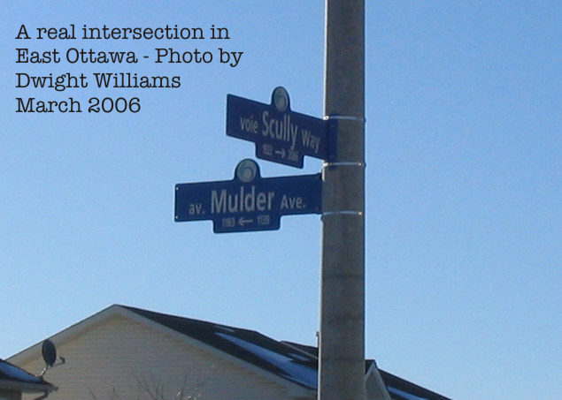
You might think this was a joke. But it ain't. The city of Ottawa really did this.
Subscribe to:
Posts (Atom)


.svg)