And if Disney/Marvel asks me to take it down, I will. Seems fair enough.
Showing posts with label comic book. Show all posts
Showing posts with label comic book. Show all posts
Tuesday, December 18, 2012
Temporary Substitution
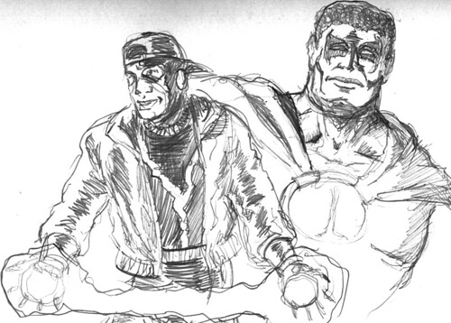
Since my Livejournal's down for what the management's calling "emergency maintenance" - I'm wondering if it's not more dissident-suppression aimed at many of the Russophones in Russia and neighbouring countries, and would be glad of additional info from all credible sources - I'm going to post from here for now.
As a reward for the loyalists who keep dropping in here, here's a rough sketch I've been fiddling with. I may replace it with something better in the days ahead.
And if Disney/Marvel asks me to take it down, I will. Seems fair enough.
And if Disney/Marvel asks me to take it down, I will. Seems fair enough.
Thursday, November 15, 2012
Ottawa Small Press Book Fair
Here we go...one more time!
I'll be back at Rob McLennan's latest instalment of the Ottawa Small Press Book Fair this Saturday.
I've got a list of what I'll be selling here at my Livejournal, if you're interested. Hoping to see lots of friendly faces on Saturday!
I'll be back at Rob McLennan's latest instalment of the Ottawa Small Press Book Fair this Saturday.
I've got a list of what I'll be selling here at my Livejournal, if you're interested. Hoping to see lots of friendly faces on Saturday!
Thursday, November 08, 2012
Speaking of Job Creation in the Arts?
May as well trying to create work for myself, right?
http://dewline.livejournal.com/586421.html
http://dewline.livejournal.com/586421.html
Saturday, June 30, 2012
Just a Book Fair Reminder!
Just to refresh your memories: the Ottawa Small Press Book Fair's "Spring 2012" Edition is today!
Hoping to see you there!
Hoping to see you there!
Wednesday, June 27, 2012
Ottawa Small Press Book Fair
I thought I'd post a catalogue beforehand.
As to when and where...see this link!
Available for sale at the Fair:
- Kagemono: Flowers and Skulls - for mature readers - $ 20.00
- Local Hero # 1 - $ 3.00
- Evening Shift - $ 2.00
- Ashcan Sampler 2004 - $2.00
- Ashcan Sampler 2007- $5.00
- Ashcan Sampler 2008 - $ 5.00
- Ashcan Sampler 2009 - $ 5.00
- Ashcan Sampler 2010 - $ 5.00
- Ashcan Sampler 2011 - $ 5.00
Sketches - Pencil - $ 10.00; Inked - $ 15.00
Discounts available if you provide the paper. If you've got a favourite character, relative, etc., bring visuals for reference!
Sunday, May 27, 2012


Tuesday, May 22, 2012
Heroes of Dakota
Icon and Static, two of the Milestone Media pantheon of heroes, villains and others now under license to DC.
Monday, May 14, 2012
So...Ottawa Comiccon
Expect to see a link to a Flickr gallery of pix taken during my visit to that event on Saturday.
More to follow...
More to follow...
Friday, May 04, 2012
The Library of Dwight Williams - April 2012


The Library of Dwight Williams - April 2012, a set on Flickr.
Yeah, I know. I'm telling WAY too much about myself here with these photos...
Sunday, August 28, 2011
CAN-CON 2011
I've been busy elsewhere for a fair while now. The day-job's been part of the reason for that, so have family-related matters, and a bit of stuff on my other blogs. If you've been following those other blogs, you've possibly already got a clue as to where this particular post is going.
But today is the day the situation's made clear:
I'm serving on the organizing committee - "ConComm" - of a local convention as a design consultant. The convention is CAN-CON 2011, the Conference on Canadian Content in Speculative Arts and Literature.
CAN-CON was revived last year after spending the previous decade in something like a coma. This is our second year back, and we're looking to build on the success of last year's revival. Our comics-related line-up is led off by Comics Guest of Honour Leonard Kirk.
But we don't stop there, including local writer/artists Jay (Kagigi the Raven) Odjick and Janet Hetherington.
Oh! I'll be sitting on a couple of panels as well!
If you should happen to be in Ottawa on the September 9th-11th weekend, I hope we see you there!
Sunday, December 06, 2009
An experiment in fiction-mapping
Been thinking of the work done by Keith Giffen, and Tom and Mary Bierbaum on the Legion of Super-Heroes of late...and teaching myself how to use Adobe Illustrator as well. So...
 |
| From Mythical Maps |
Wednesday, February 13, 2008

Sunday, November 25, 2007
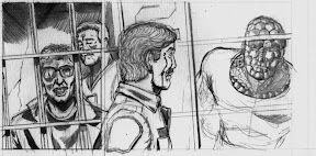
Local Hero: In the cells with the Eagles and a Gator
Thought you might appreciate a visual update...

Saturday, October 13, 2007

Thursday, August 23, 2007
Saturday, August 18, 2007
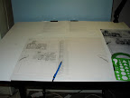
Clearing the decks
Because I felt like it, and because it now feels like I'm making additional progress on the art front...a picture of my drafting table.

Monday, March 05, 2007
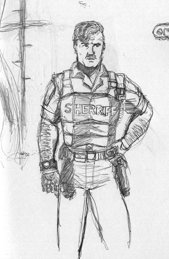
Character Design/Studies - U.S. Steel and Gator Jones

Hi again. I'm revisiting Gator Jones for a little bit here, and throwing in some facial expression studies of U.S. Steel - one of the antagonists of Local Hero - while I'm at it.
Something that got drilled into my head in animation school - rightly - is the need to explore how your characters would express their every mood variation. Or at least as many as you could imagine them expressing, publicly or privately.
I must post entries here more often.
Wednesday, February 21, 2007
Tribute to Tony and Eddy

One of the series I've enjoyed over the years has been the first eight issues of the second Black Lightning series, written by Tony Isabella, artwork mainly by Eddy Newell. In addition to the exploration of issues of urban life in the American Great Lakes, the ethics of superheroics, and what constitutes doing the right thing...well, I still believe that the best uniform design to date for the character was Eddy's own.
Occasionally, I find myself drawn to do studies of that character in that outfit. Just because.
Tony? Eddy? Thanks again.
Thursday, November 09, 2006
Font Experimentation
I am nothing if not either prolific or a wannabe polymath.
Specifically, a font inspired by pre-1985 "Kryptonese"One of the side projects I've mentioned over at my Other Blog has been experimental font design, inspired by the comics of years gone by. as compiled by E. Nelson Bridwell, with the notes passed along to Al Turniansky by the late Rich Morrissey.
I'm about ¾ of the way to completion on the letter-glyphs, fully done on the numerals and punctuation. The letter-glyphs are one of the tough parts, numbering 118 in all. Check this site if you have any doubts. It's what I've been using as reference for this project.
The other potential headache is this: the rules of "Bridwellian" punctuation dictate that the "open parentheses" equivalent must be directly over the first character inside the parentheses. "Close parentheses" symbology is placed under the last character in the parentheses-equivalents. Underlining-equivalent has its own symbol, as a quick referral to the chart on the other end of the above link will show. Not being a professional typographic designer, I must admit to being somewhat stumped by this issue.
If you want to try out what I've got in place so far, here's the font. Right-click to save the font, and please scan the guts out of it with whatever security software you're using before you install it. Just because I've been careful doesn't mean you shouldn't as well, right?
I'll upload a chart to show what goes where and which symbols represents which sounds ASAP.
Saturday, October 28, 2006
Subscribe to:
Posts (Atom)