Last week, She has her own goals in mind for the answers to that question, regarding accessibility, and she's been getting useful answers from her friendlist. For myself, selfishly, I do have a list of favourites. Many - most? - of these favourites have very little to do with such concerns. There's a lot of aesthetic considerations and a lot of personal nostalgia in play with my list. There is a certain amount of privilege - the privilege of being sighted all my life thus far - in my thinking here. This is selfish. Absolutely so.
That said, I am going to go into some detail about my own list of favoured fonts. In this entry, and probably others down the line.
I start with Space: 1999. That TV series in the mid-1970's created by Gerry and Sylvia Anderson was where I first started to care about typefaces, fonts, that sort of thing. Particularly the first season. Moonbase Alpha, the main backdrop of the series, doomed to wander the universe by an ill-placed nuclear waste dump turning a large chunk of our Moon into a giant fusion rocket...that place had a particular design aesthetic. Signage across the moonbase was in a font called "Countdown". Designed by Colin Brignall, I don't know how it reached the attention of Space: 1999's set designers and graphic designers.
He also designed Superstar, the font that Milton Glaser incorporated into the classic "Bullet" logo of DC Comics. So there's two.
Back to Space: 1999. The space suits were jumpsuits with the helmets, life support hardware, and so on worn over them. The life support hardware packs - front and back - were numbered. The numerals came from "Data 70". The packs labelled "1" were usually worn by Martin Landau in character as moonbase commander John Koenig when a scene would call for him to expect to do EVA work, and had that numeral inverted. Not sure why.
(There's apparently an argument over whether Data 70 is a knock-off of another font, Westminster. If you're interested, check this essay out.)
More to follow...
Showing posts with label opinion. Show all posts
Showing posts with label opinion. Show all posts
Monday, September 21, 2020
FONTS: Personal Favourites
Thursday, May 23, 2019
What Am I Curious About? - May 2019 Edition
Seems like a good question to answer publicly while I'm in the middle of carrying out a job search. Don't you think?
So...a partial list:
Space
Cartography
Languages
Indigenous culture in North America
Politics in other nations
Mapping the Milky Way Galaxy
Urban geography
Architecture
Urban design
Ottawa-Gatineau history
Canadian history
Street names
Psychology
Comic books
Chess
Soccer(known as "football" outside of Canada and the States)
There's others to be added to the list, but here's a starting point.
FYI: My other weblog.
Sunday, February 10, 2019
Sunday, March 02, 2014
About Weblogs and Politics
So...guessing that access to Livejournal's getting problematic again, owing to relations with Vladimir Putin, hm?
Or - perhaps more accurately - if it isn't now, it will be sooner than later?
What do you think? Normally, I'd ask the question over at my Livejournal account...
Wednesday, February 05, 2014
Maps of Interest - Volume 1


Maps of Interest, a gallery on Flickr.
Some maps posted on Flickr by other people that caught my attention. You might enjoy a look-see as well...
Thursday, November 17, 2011
One little design link for today
Ray Larabie pointed out a design-related rant that might be of some interest to all of us working...with our hands.
Go take a look. Might be worth at least ten minutes of your life.
Go take a look. Might be worth at least ten minutes of your life.
Sunday, November 13, 2011
Signage from the Local Protest
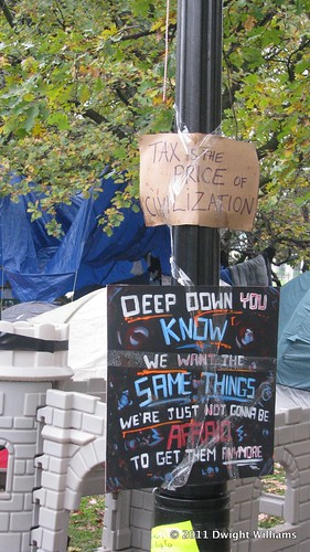
I have to admit to liking the uppermost sign. Its contents are a Truth.
Monday, February 08, 2010
Been fiddling with any number of things over the last few weeks:
More as I think of it...
- Training in Illustrator and Photoshop, check.
- Indesign, not so much. I want to do something useful about that between now and next posting.
- Manga Studio, check. Managed to do a demo session at the ByMUG meeting yesterday, to boot. I could've managed the computer-projector interface settings better, mind you...
- Celestia, check. Astronomy software is a good thing for a guy working on space opera projects to have as a general rule. Whether you're writing or illustrating, that's a good rule to heed.
More as I think of it...
Subscribe to:
Posts (Atom)

.svg)