Showing posts with label design. Show all posts
Showing posts with label design. Show all posts
Sunday, March 29, 2020


Thursday, November 08, 2012
Speaking of Job Creation in the Arts?
May as well trying to create work for myself, right?
http://dewline.livejournal.com/586421.html
http://dewline.livejournal.com/586421.html
Tuesday, July 31, 2012
Wordmarks: Brightside Prototypes 1
Some unused ideas for a logo/wordmark project. Uploaded with permission from the original client.

Saturday, July 21, 2012

Thursday, July 12, 2012
Recommended Reading: Full Frontal T.O.
Not my work...but worth getting!
For your bookstore (hoping it's an independent shop): ISBN 978 1 55245 257 8

For your bookstore (hoping it's an independent shop): ISBN 978 1 55245 257 8
Tuesday, May 22, 2012
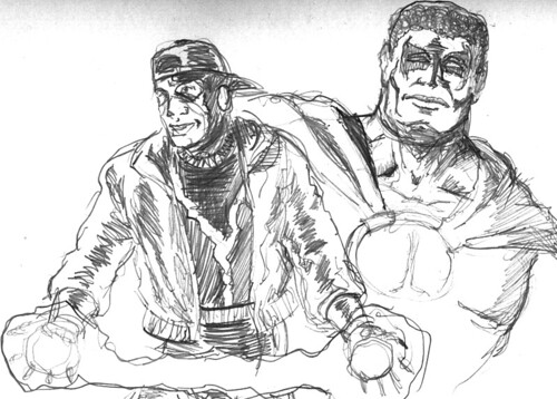
Heroes of Dakota
Icon and Static, two of the Milestone Media pantheon of heroes, villains and others now under license to DC.
Thursday, November 17, 2011
One little design link for today
Ray Larabie pointed out a design-related rant that might be of some interest to all of us working...with our hands.
Go take a look. Might be worth at least ten minutes of your life.
Go take a look. Might be worth at least ten minutes of your life.
Sunday, November 13, 2011
Signage from the Local Protest
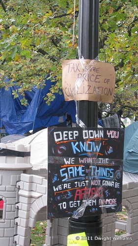
I have to admit to liking the uppermost sign. Its contents are a Truth.
Sunday, November 11, 2007
One small lesson
Learned the hard way.
Never use Deleter colour pens on Peter Pauper Press sketchbooks. Sure, the results look cool. But the ink goes right through the page. (Certain other brands of brush pen marker, too, while I'm at it.)
Prismacolor Premier fine line markers, though? That's another, happier story.
I still like the sketchbooks. I just need thicker paper for some types of pen.
Never use Deleter colour pens on Peter Pauper Press sketchbooks. Sure, the results look cool. But the ink goes right through the page. (Certain other brands of brush pen marker, too, while I'm at it.)
Prismacolor Premier fine line markers, though? That's another, happier story.
I still like the sketchbooks. I just need thicker paper for some types of pen.
Monday, March 05, 2007
Character Design/Studies - U.S. Steel and Gator Jones

Hi again. I'm revisiting Gator Jones for a little bit here, and throwing in some facial expression studies of U.S. Steel - one of the antagonists of Local Hero - while I'm at it.
Something that got drilled into my head in animation school - rightly - is the need to explore how your characters would express their every mood variation. Or at least as many as you could imagine them expressing, publicly or privately.
I must post entries here more often.
Saturday, August 26, 2006
Local Hero - A first sampling in Character Design
We've all seen them in print and online over the years: pieces of how a character evolves from first sketch to the finished pages.
Ian and I talked it over, and for today's edition, we'll cover Gator Jones, one of the keys of the first Local Hero arc. Gator's one of those guys who always seem to get the short end of the genetic stick in the genre as we know it. If the nickname wasn't a giveaway on that score, well...
 Now this first drawing was the earliest design sketch I could find or remember for Gator, dating back to late 2002.
No, I'm not kidding about that. All good things take their appointed time, after all.
Anyway: I took the "Gator" nickname quite literally, of course, and this had to be remedied somewhat...
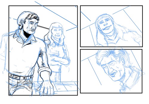
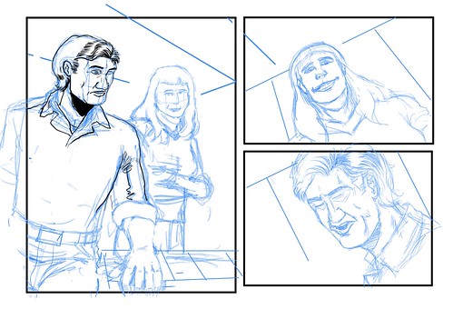
 Now we move onto some rough layouts for his first appearance on-panel...

And I think I'll refrain from showing the finished page. For now, at least.
One thing that kept bugging me from the first redesign onward is the fact that we've seen guys with Gator's particular luck of the genetic draw before in other fictons, in comic books and out. I've wanted to evolve him into someone distinct from anyone else we're already familiar with. I hope I succeed in that. It'll be for you to judge, though...
Ian and I talked it over, and for today's edition, we'll cover Gator Jones, one of the keys of the first Local Hero arc. Gator's one of those guys who always seem to get the short end of the genetic stick in the genre as we know it. If the nickname wasn't a giveaway on that score, well...
 Now this first drawing was the earliest design sketch I could find or remember for Gator, dating back to late 2002.
No, I'm not kidding about that. All good things take their appointed time, after all.
Anyway: I took the "Gator" nickname quite literally, of course, and this had to be remedied somewhat...

And of course, further refinements followed:

 Now we move onto some rough layouts for his first appearance on-panel...

And I think I'll refrain from showing the finished page. For now, at least.
One thing that kept bugging me from the first redesign onward is the fact that we've seen guys with Gator's particular luck of the genetic draw before in other fictons, in comic books and out. I've wanted to evolve him into someone distinct from anyone else we're already familiar with. I hope I succeed in that. It'll be for you to judge, though...
Subscribe to:
Posts (Atom)