Tuesday, October 27, 2020
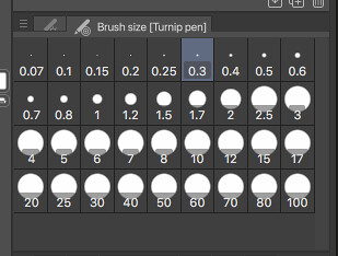
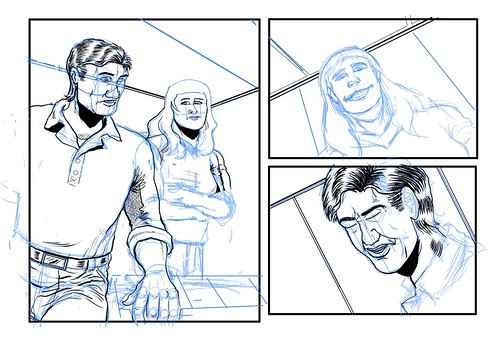
ComicsTech: Solved My CSP Question
Monday, September 21, 2020
FONTS: Personal Favourites
Last week, She has her own goals in mind for the answers to that question, regarding accessibility, and she's been getting useful answers from her friendlist. For myself, selfishly, I do have a list of favourites. Many - most? - of these favourites have very little to do with such concerns. There's a lot of aesthetic considerations and a lot of personal nostalgia in play with my list. There is a certain amount of privilege - the privilege of being sighted all my life thus far - in my thinking here. This is selfish. Absolutely so.
That said, I am going to go into some detail about my own list of favoured fonts. In this entry, and probably others down the line.
I start with Space: 1999. That TV series in the mid-1970's created by Gerry and Sylvia Anderson was where I first started to care about typefaces, fonts, that sort of thing. Particularly the first season. Moonbase Alpha, the main backdrop of the series, doomed to wander the universe by an ill-placed nuclear waste dump turning a large chunk of our Moon into a giant fusion rocket...that place had a particular design aesthetic. Signage across the moonbase was in a font called "Countdown". Designed by Colin Brignall, I don't know how it reached the attention of Space: 1999's set designers and graphic designers.
He also designed Superstar, the font that Milton Glaser incorporated into the classic "Bullet" logo of DC Comics. So there's two.
Back to Space: 1999. The space suits were jumpsuits with the helmets, life support hardware, and so on worn over them. The life support hardware packs - front and back - were numbered. The numerals came from "Data 70". The packs labelled "1" were usually worn by Martin Landau in character as moonbase commander John Koenig when a scene would call for him to expect to do EVA work, and had that numeral inverted. Not sure why.
(There's apparently an argument over whether Data 70 is a knock-off of another font, Westminster. If you're interested, check this essay out.)
More to follow...
Thursday, September 10, 2020
Monday, September 07, 2020
CBC: Ideas - A Search for the Common Good
Listening to this one at the moment:
Our Future Ancestors Deserve a Voice...
Food for a lot of thought for any storyteller.
Tuesday, September 01, 2020
Noting the Russian Attention
If you're trying to check my home page?
Wednesday, August 26, 2020
Wednesday, April 15, 2020
Friday, April 10, 2020
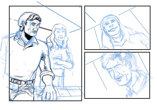
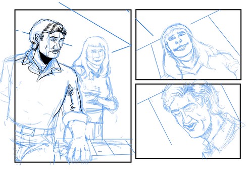
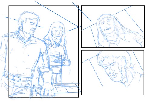
Pericles Project
More on the other side of the link. Just click on the image below.

Monday, April 06, 2020
Repairs and Renovations Notice 2020-1
As a temporary fix, I'm setting up links with this posting.
Logo Experiments
Other Graphic Design Stuff
Photos
Mythical Maps
Sketches
Trek-Inspired Design Sketchery
Op-Ed Portfolio
Courtroom Art
Transit Map Ideas
Hoping that this works...
Friday, April 03, 2020
PHOTOS: Seen On a Weekend Walk
Sunday, March 29, 2020
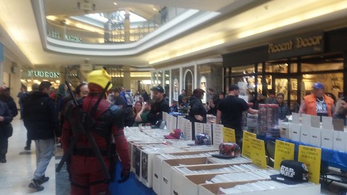
PHOTOS: Place d'Orléans Mall in Happier Days


.svg)