Sunday, October 01, 2023

Edge of Midnight Base Map - A Work in Progress

I've been working on this for fun, for mental health, for skills retention and development. It's inspired by Star Trek: Star Charts and Stellar Cartography, of course, and ties into a work of fan fiction as historical textbook: The Edge of Midnight - A Narrative of the Federation-Klingon Cold War (2256-2293). There are some *ahem* deviations from the work in those first two volumes, some of them per the text of Seamus Devenish, others via the out-of-print FASA-published Star Trek Role-Playing Game product line. Where not confirmed by Star Charts and Stellar Cartography, or stated in the text of The Edge of Midnight, the choice of host stars for many planets is mine, with no small additional input from Jed Whitten's HYGMap website and Kevin Jardine at GalaxyMap.org.

I do expect that CBS/Paramount and their Star Trek production partners retain the right to ignore any or all of this material as it suits them.

Again, this is a work in progress. If you have informed opinions on how I might fill in the remaining gaps, feel free to comment. I won't promise to either heed or ignore you.

If you want to read the material that inspired this project, I recommend you to visit this website. EoM-DisputedZone-1Oct2023-A

Tuesday, October 04, 2022

Inspired by Inktober, Yet Apart From It

This was inspired by Inktober.

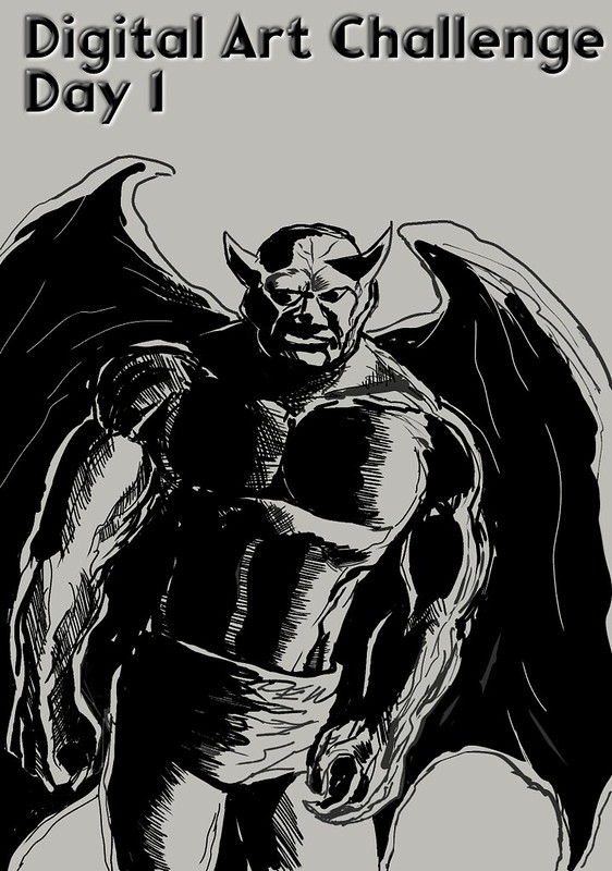
Since this was drawn using Clip Studio Paint, I cannot claim this as an Inktober activity. I still intend to use those prompts for this year's edition of Inktober to inspire some efforts at daily illustration practice. Hence this generic gargoyle design.
Digital Ink Challenge - Gargoyle
I've already given up on the idea of getting a sketch finished per day...and I still want to try for addressing every item in the Inktober prompt list for this year anyway.

Sketch # 2 - "Scurry"

This was the first thought I had for it.

GraphicDesign-DEW-Scurry

Saturday, September 11, 2021

Anniversaries That Matter To Me Today

 There is more than the one. As a reminder, this link to an earlier blog entry.

https://dewline.dreamwidth.org/1559387.html

Thursday, January 14, 2021

Map Galleries Volume 2

So, I found a few more maps of interest to me, thanks to help from quite a few other people on Flickr...

Maps of Interest - Volume 2

Tuesday, October 27, 2020

ComicsTech: Solved My CSP Question

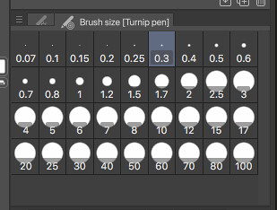
Turns out I had brushes set to "millimetres" rather than "pixels". That was my mistake. Anyway, problem solved now. My apologies for taking so long to post an update about that!

Monday, September 21, 2020

FONTS: Personal Favourites

Last week, spoke about preferred fonts for accessibility re: websites. Also, she asked this question:

Do folks have favorite fonts?

She has her own goals in mind for the answers to that question, regarding accessibility, and she's been getting useful answers from her friendlist. For myself, selfishly, I do have a list of favourites. Many - most? - of these favourites have very little to do with such concerns. There's a lot of aesthetic considerations and a lot of personal nostalgia in play with my list. There is a certain amount of privilege - the privilege of being sighted all my life thus far - in my thinking here. This is selfish. Absolutely so.

That said, I am going to go into some detail about my own list of favoured fonts. In this entry, and probably others down the line.

I start with Space: 1999. That TV series in the mid-1970's created by Gerry and Sylvia Anderson was where I first started to care about typefaces, fonts, that sort of thing. Particularly the first season. Moonbase Alpha, the main backdrop of the series, doomed to wander the universe by an ill-placed nuclear waste dump turning a large chunk of our Moon into a giant fusion rocket...that place had a particular design aesthetic. Signage across the moonbase was in a font called "Countdown". Designed by Colin Brignall, I don't know how it reached the attention of Space: 1999's set designers and graphic designers.

He also designed Superstar, the font that Milton Glaser incorporated into the classic "Bullet" logo of DC Comics. So there's two.

Back to Space: 1999. The space suits were jumpsuits with the helmets, life support hardware, and so on worn over them. The life support hardware packs - front and back - were numbered. The numerals came from "Data 70". The packs labelled "1" were usually worn by Martin Landau in character as moonbase commander John Koenig when a scene would call for him to expect to do EVA work, and had that numeral inverted. Not sure why.

(There's apparently an argument over whether Data 70 is a knock-off of another font, Westminster. If you're interested, check this essay out.)

More to follow...

Thursday, September 10, 2020

COMICS/TECH: A Software Question

Anyone who's using Clip Studio Paint, does this look right to you? CSP_BrushSizeOptions

Monday, September 07, 2020

Tuesday, September 01, 2020

Noting the Russian Attention

Twenty-one page views of this blog, all from Yandex-dot-ru this past four weeks or so? Interesting. I really should post some sketches or photography more often to get a wider audience.