I am nothing if not either prolific or a wannabe polymath.
Specifically, a font inspired by pre-1985 "Kryptonese"One of the side projects I've mentioned over at my Other Blog has been experimental font design, inspired by the comics of years gone by. as compiled by E. Nelson Bridwell, with the notes passed along to Al Turniansky by the late Rich Morrissey.
I'm about ¾ of the way to completion on the letter-glyphs, fully done on the numerals and punctuation. The letter-glyphs are one of the tough parts, numbering 118 in all. Check this site if you have any doubts. It's what I've been using as reference for this project.
The other potential headache is this: the rules of "Bridwellian" punctuation dictate that the "open parentheses" equivalent must be directly over the first character inside the parentheses. "Close parentheses" symbology is placed under the last character in the parentheses-equivalents. Underlining-equivalent has its own symbol, as a quick referral to the chart on the other end of the above link will show. Not being a professional typographic designer, I must admit to being somewhat stumped by this issue.
If you want to try out what I've got in place so far, here's the font. Right-click to save the font, and please scan the guts out of it with whatever security software you're using before you install it. Just because I've been careful doesn't mean you shouldn't as well, right?
I'll upload a chart to show what goes where and which symbols represents which sounds ASAP.
Thursday, November 09, 2006
Wednesday, November 01, 2006
Urban SF Humour - X-Files and the Ottawa Streets
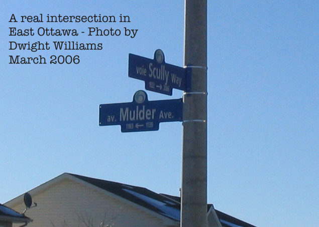
You might think this was a joke. But it ain't. The city of Ottawa really did this.
Subscribe to:
Posts (Atom)